


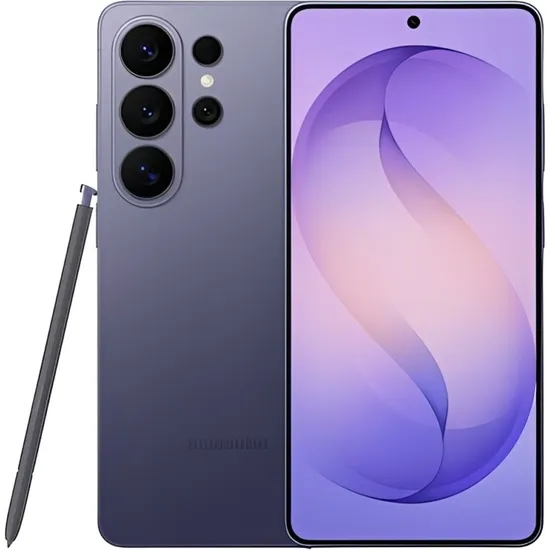
Smartphone Samsung Galaxy S26 Ultra S948B 5G DS 16/1TB 6.9" 200+10+50+50/12MP - Violet
Disponível desde 21 de Abril de 2026
Última listagem em 01 de Maio de 2026
Compartilhar

código: #1549508
Por:
US$ 1.590,00
R$ 8.124,90
* Os preços e a disponibilidade estão
sujeitos a alterações sem aviso prévio.
Informar preço incorreto ou indisponibilidade
Informações Extras
/* Estilos globales */
.free-content-container {
font-family: 'Segoe UI', 'Roboto', 'Helvetica Neue', sans-serif;
width: 100%;
margin: 0 auto;
background-color: #0a0a0a;
color: #ffffff;
overflow: hidden;
box-sizing: border-box;
}
.section {
padding: 60px 40px;
position: relative;
}
.container {
max-width: 1200px;
margin: 0 auto;
position: relative;
z-index: 2;
}
/* Estilos de parallax */
/* Estilos de sección Hero */
.hero-section {
display: flex;
flex-direction: column;
align-items: center;
text-align: center;
padding: 80px 40px;
background: linear-gradient(135deg, #0a0a0a, #1a1a1a);
min-height: 500px;
}
.logo {
max-width: 180px;
margin-bottom: 30px;
}
.title {
font-size: 3.5rem;
font-weight: 800;
margin-bottom: 15px;
background: linear-gradient(to right, #ffffff, #3b82f6);
-webkit-background-clip: text;
background-clip: text;
color: transparent;
}
.subtitle {
font-size: 1.5rem;
font-weight: 300;
margin-bottom: 30px;
opacity: 0.9;
}
.description {
max-width: 700px;
margin: 0 auto 40px;
line-height: 1.6;
font-size: 1.1rem;
opacity: 0.8;
}
.main-image-container {
width: 100%;
max-width: 500px;
margin: 20px auto;
}
.main-image {
max-width: 100%;
height: auto;
border-radius: 10px;
box-shadow: 0 20px 40px rgba(0, 0, 0, 0.2);
filter: drop-shadow(0 0 20px #3b82f660);
}
/* Estilos de sección de texto */
.text-section {
background-color: #0a0a0a;
}
.section-title {
font-size: 2.5rem;
font-weight: 700;
margin-bottom: 30px;
color: #3b82f6;
text-align: center;
}
.text-content {
line-height: 1.8;
font-size: 1.1rem;
}
.text-center {
text-align: center;
}
.text-left {
text-align: left;
}
.text-right {
text-align: right;
}
/* Estilos de sección de imagen */
.image-section {
background-color: #1a1a1a;
}
.image-container {
margin: 0 auto;
}
.image-size-small {
max-width: 300px;
}
.image-size-medium {
max-width: 500px;
}
.image-size-large {
max-width: 800px;
}
.image {
max-width: 100%;
height: auto;
border-radius: 10px;
box-shadow: 0 10px 30px rgba(0, 0, 0, 0.15);
}
.image-caption, .video-caption {
margin-top: 15px;
font-size: 0.9rem;
opacity: 0.8;
}
/* Estilos de sección de video */
.video-section {
background-color: #0a0a0a;
}
.video-container {
width: 100%;
max-width: 800px;
margin: 0 auto;
border-radius: 12px;
overflow: hidden;
box-shadow: 0 20px 40px rgba(0, 0, 0, 0.3);
}
.video {
width: 100%;
height: 450px;
border: none;
}
/* Estilos de sección de características */
.features-section {
background-color: #1a1a1a;
}
.features-layout-grid {
display: grid;
grid-template-columns: repeat(auto-fit, minmax(300px, 1fr));
gap: 30px;
}
.features-layout-list {
display: flex;
flex-direction: column;
gap: 20px;
max-width: 800px;
margin: 0 auto;
}
.feature-card {
background: linear-gradient(145deg, #0a0a0a80, #1a1a1a);
border-radius: 12px;
padding: 30px;
box-shadow: 0 10px 30px rgba(0, 0, 0, 0.1);
border: 1px solid #2a2a2a;
transition: all 0.3s ease;
}
.feature-card:hover {
transform: translateY(-10px);
box-shadow: 0 15px 35px rgba(0, 0, 0, 0.2);
border-color: #3b82f680;
}
.feature-icon {
width: 60px;
height: 60px;
background-color: #3b82f6;
border-radius: 50%;
display: flex;
align-items: center;
justify-content: center;
margin-bottom: 20px;
font-size: 24px;
color: #0a0a0a;
box-shadow: 0 10px 20px #3b82f640;
}
.feature-title {
font-size: 1.4rem;
font-weight: 600;
margin-bottom: 15px;
color: #3b82f6;
}
.feature-description {
font-size: 1rem;
line-height: 1.6;
opacity: 0.8;
}
/* Estilos de sección de galería */
.gallery-section {
background-color: #0a0a0a;
}
.gallery-grid {
display: grid;
grid-template-columns: repeat(auto-fit, minmax(300px, 1fr));
gap: 20px;
}
.gallery-item {
border-radius: 10px;
overflow: hidden;
box-shadow: 0 10px 30px rgba(0, 0, 0, 0.15);
transition: all 0.3s ease;
}
.gallery-item:hover {
transform: scale(1.03);
box-shadow: 0 15px 40px rgba(0, 0, 0, 0.2);
}
.gallery-image {
width: 100%;
height: auto;
display: block;
}
.gallery-video {
width: 100%;
height: 200px;
border: none;
}
.gallery-caption {
padding: 15px;
background-color: #1a1a1a;
font-size: 0.9rem;
text-align: center;
}
/* Estilos de sección de especificaciones */
.specs-section {
background-color: #1a1a1a;
}
.specs-table {
width: 100%;
max-width: 800px;
margin: 0 auto;
border-collapse: collapse;
}
.specs-table tr {
border-bottom: 1px solid #2a2a2a;
transition: all 0.3s ease;
}
.specs-table tr:hover {
background-color: #1a1a1a50;
}
.specs-table th,
.specs-table td {
padding: 15px 20px;
text-align: left;
}
.specs-table th {
font-weight: 600;
color: #3b82f6;
width: 40%;
}
/* Estilos de sección de llamada a la acción */
.cta-section {
text-align: center;
padding: 80px 40px;
}
.cta-title {
font-size: 3rem;
font-weight: 800;
margin-bottom: 20px;
color: #ffffff;
}
.cta-subtitle {
font-size: 1.5rem;
margin-bottom: 40px;
opacity: 0.9;
}
.cta-button {
display: inline-block;
padding: 15px 40px;
background: linear-gradient(to right, #3b82f6, #f97316);
color: #ffffff;
font-size: 1.2rem;
font-weight: 600;
text-decoration: none;
border-radius: 50px;
box-shadow: 0 10px 30px #3b82f640;
transition: all 0.3s ease;
}
.cta-button:hover {
transform: translateY(-5px);
box-shadow: 0 15px 40px #3b82f660;
}
/* Estilos específicos de layout y animaciones */
.section {
padding: 60px 40px;
}
.card {
background: #1a1a1a80;
backdrop-filter: blur(10px);
}
@keyframes fadeIn {
from { opacity: 0; }
to { opacity: 1; }
}
.animate {
animation: fadeIn 1s ease-out;
}
/* Responsive */
@media (max-width: 768px) {
.section {
padding: 40px 20px;
}
.title {
font-size: 2.5rem;
}
.subtitle {
font-size: 1.2rem;
}
.description {
font-size: 1rem;
}
.section-title {
font-size: 2rem;
}
.video {
height: 300px;
}
.feature-card {
padding: 20px;
}
.cta-title {
font-size: 2.5rem;
}
.cta-subtitle {
font-size: 1.2rem;
}
}
@media (max-width: 480px) {
.section {
padding: 30px 15px;
}
.title {
font-size: 2rem;
}
.subtitle {
font-size: 1rem;
}
.description {
font-size: 0.9rem;
}
.section-title {
font-size: 1.8rem;
}
.video {
height: 200px;
}
.gallery-grid {
grid-template-columns: 1fr;
}
.features-layout-grid {
grid-template-columns: 1fr;
}
.cta-title {
font-size: 2rem;
}
.cta-subtitle {
font-size: 1rem;
}
.cta-button {
padding: 12px 30px;
font-size: 1rem;
}
}
/* Grid Layout Styles */
.grid-container {
display: grid;
gap: 10px;
width: 100%;
grid-template-areas:
"big-left top-middle top-middle top-right"
"big-left middle-left middle-right bottom-right"
"big-left bottom-left bottom-middle bottom-right";
grid-template-columns: 1fr 1fr 1fr 1fr;
grid-template-rows: 1fr 1fr 1fr;
}
.grid-item {
border-radius: 20px;
overflow: hidden;
position: relative;
min-height: 200px;
}
.grid-item img, .grid-item iframe {
width: 100%;
height: 100%;
object-fit: cover;
position: absolute;
top: 0;
left: 0;
}
.grid-item:nth-child(1) {
grid-area: big-left;
}
.grid-item:nth-child(2) {
grid-area: top-middle;
}
.grid-item:nth-child(3) {
grid-area: top-right;
}
.grid-item:nth-child(4) {
grid-area: middle-left;
}
.grid-item:nth-child(5) {
grid-area: middle-right;
}
.grid-item:nth-child(6) {
grid-area: bottom-left;
}
.grid-item:nth-child(7) {
grid-area: bottom-middle;
}
.grid-item:nth-child(8) {
grid-area: bottom-right;
}
.grid-caption {
position: absolute;
bottom: 0;
left: 0;
right: 0;
padding: 10px;
background: rgba(0, 0, 0, 0.7);
color: white;
font-size: 0.9rem;
}
@media (max-width: 768px) {
.grid-container {
grid-template-areas:
"big-left big-left"
"top-middle top-right"
"middle-left middle-right"
"bottom-left bottom-middle"
"bottom-right bottom-right";
grid-template-columns: 1fr 1fr;
grid-template-rows: auto;
}
}
@media (max-width: 480px) {
.grid-container {
grid-template-areas:
"big-left"
"top-middle"
"top-right"
"middle-left"
"middle-right"
"bottom-left"
"bottom-middle"
"bottom-right";
grid-template-columns: 1fr;
}
}
Galaxy S26 Ultra
Potencia, cámara profesional y diseño premium en su máxima expresión.
El Galaxy S26 Ultra redefine la gama premium con un diseño sofisticado, construcción de alta resistencia y una pantalla de última generación que ofrece colores intensos y fluidez excepcional. Incorpora un procesador ultrapotente optimizado para inteligencia artificial, sistema de cámaras avanzado con nivel profesional y una batería de larga duración que acompaña tu ritmo todo el día. Potencia, precisión y tecnología de vanguardia en un solo dispositivo.

